
A formal complaint has flagged ‘critical gaps’ in the design and implementation of tactile paving and accessible signage across Mumbai’s suburban railway stations by the Walking Project, which works to make Mumbai’s footpaths more walkable, safe, and accessible. The complaint petition states that the tactile tiles at every station follow a different pattern despite the existence of a national standard.
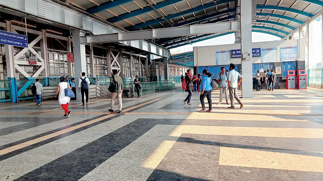
A Khar station platform which adheres to accessibility guidelines
The complaint warns that inconsistent and incorrect usage is creating confusion and safety risks for visually impaired passengers. Vedant Mhatre, programme director of the Walking Project, said, “It is being wrongly used across suburban stations. The result: confusion on platforms, missed paths, and in some cases, dangerous missteps. At Dombivali, warning tiles meant for hazards have reportedly been laid out like guiding paths—blurring the line between ‘safe to walk’ and ‘stop, danger ahead’.” For a visually impaired commuter, that mix-up can be the difference between staying on the platform and stepping off it.
What are tactile tiles?
For visually impaired passengers, safe and independent navigation depends on a clear, continuous, and intuitive system built on two fundamental principles:
>> Warning tiles (dot patterns) to indicate hazards such as platform edges, staircases, level changes, and decision points
>> Guiding tiles (linear patterns) to define uninterrupted movement routes across the station
Platform 3 of Dombivli railway station, where warning dots have been wrongly used instead of linear guideline tiles
What national guidelines say
All existing and future works must strictly comply with the Harmonised Guidelines and Standards for Universal Accessibility issued by the Ministry of Housing and Urban Affairs.
The Tactile Ground Surface Indicators (TGSI) provide guidance and hazard warnings for visually impaired users through dot (warning) and line (directional) patterns.
It must be used selectively, with proper dimensions (min 600 mm depth), strong contrast, correct orientation, and continuous, obstruction-free paths. Installed at crossings, stairs, ramps, entrances, and key routes, it should be planned holistically — poor or partial use can be unsafe.
What is the issue?
The problem Western and Central Railway stations exhibit inconsistency and, in many cases, incorrect application of these elements, leading to confusion and safety risks
Platform 1 of Thakurli railway station, where a confusing mix of guidelines has been installed
The irony The city already has working models. Khar Road station and the Mumbai Metro network have been singled out for getting it right with their clear, continuous, and readable tactile systems
The demand Audit everything and follow the rulebook speedily. With stations being revamped under the Amrit Bharat scheme, Mhatre warns that bad design today will become a bigger hazard tomorrow
Key examples
>> At Dombivli railway station, warning tiles have been used in place of guiding tiles
>> A recently commissioned foot overbridge at Ghatkopar station lacks tactile paving
>> A jumble of tactile guidelines exists on platform 1 of Thakurli station
>> There is no continuity in the tiling on platform 3 at Santacruz station. Though it is appropriate, the paving is poorly maintained
2021 incident
Central Railway pointsman Mayur Shelke is remembered for his split-second heroism, where he jumped onto the tracks and ran in front of an approaching train, exposing the absence of reliable tactile paving at the platform edge. The mother of the kid who fell on the tracks was visually impaired, and she had failed to gauge the edge of the platform. What appeared to be a dramatic rescue was, in fact, a preventable lapse: missing or poorly implemented tactile tiles posed a life-threatening risk.
OfficialSpeak a spokesperson
Central Railway
‘Central Railway is implementing Divyang-friendly initiatives, including tactile pavings, in a step-by-step manner. Lacunae will be corrected on priority as per guidelines. We request users to bring discrepancies to the notice of the authorities so appropriate corrective action can be taken.’
Harmonised Standards and Guidelines for Universal Accessibility in India issued by the Ministry of Housing and Urban Affairs
A spokesperson
Western Railway
‘Western Railway has tried to follow all the guidelines of the Harmonised Guidelines and Standards for Universal Accessibility, and the new Khar station is our best example. We are replicating the template at all other stations as well.’
Design principles
Use sparingly (avoid clutter/confusion)
Vedant Mhatre, programme director, Walking Project
Minimum
600 mm depth for detectability
Strong visual contrast
(30-50 percent luminance)
Proper orientation (warning tiles perpendicular, set back ~300 mm)
Placement: At crossings, stairs, ramps, entrances, transport areas, and key navigation points — both outdoors and indoors.


